Professional Development Certificate Training - Data Speaks: Data Analysis, Visualization and Outreach with Microsoft Power BI

Course Date:
Translate data into actionable information and insights for informed decision making and communication using Microsoft Power BI
What gets measured, gets managed – goes the saying. But it misses out on a crucial link: what gets measured must be analyzed and visualised smartly for effective communication and influence. We live in a time of an over-abundance of data in every field. Every piece of this data, when analyzed, reveals a minefield of information. Unanalyzed, it is no good. But processed and communicated well, it becomes an excellent outreach tool, capable of making far-reaching impacts.
Hence, Centre for Science and Environment, brings you this three-day course on reading numbers and data, making sense of them, and visualising them to inform, influence and impact using the power of Power BI.
The course will help you develop skills for searching and connecting with the data which is most relevant for you; analyse, visualise and interpret it; and translate it into actionable information using Power BI. Mastering this smart data analytics tool will help you to integrate all your data in one place, analyse, and visualise your data – for effective presentation, writing and reporting.
WHAT IS POWER BI
Power BI is Microsoft’s latest business intelligence (BI) and data visualisation tool that helps you to process, analyse, visualize and share insights from your data. It helps in quickly developing stunning interactive dashboards that bring your data to life, and enables you to monitor and prepare data-driven reports on projects, programmes, businesses – for web and on mobile devices
OPEN FOR
Professionals working with non-profits, media, government agencies, research institutions, academic centres and industry – anyone who wants to sharpen the skills of data analysis and visualisation – for web and on mobile devices.
It is suited for all those professionals who are required to process, analyze data, visualise and generate impactful reports
WHAT YOU WILL LEARN:
This certificate course will develop your ability to mine, cleanse, analyse and graphically present data and create dashboards too -- on the web and on mobile devices. It will equip you with the knowledge and skills required to present data intelligently in your reports, research or story across digital, social and print mediums.
The key take aways are:
- Find/discover data on socio-economic issues
- Import data ( statistical data, real-time data, big data)
- Clean, Process and Analyse data
- How to analyse and transform data
- Transform data into stunning interactive visualizations and share insights from data - on-premises and in the cloud—all in one view
- Create dashboards, interactive reports and APIs – publish on the web and on mobile devices
PREREQUISITES :
Some experience in working with data from Excel, databases, or text files
COURSE DURATION
COURSE VENUE
Centre for Science and Environment
41, Tughlakabad Institutional Area New Delhi-110062, India
COURSE FEES
- The course is available to you at a *fee of Rs 15,000 per participant.
- *Course fee includes instructional fee, reading material, lunch and refreshments. Accommodation and related costs are not included in the cost. However, CSE can help you find a place to stay.
- The course fee should be paid in advance by demand draft / cheque / bank transfer in the name of CENTRE FOR SCIENCE AND ENVIRONMENT. Details for bank transfer will be provided on request.
TRAINERS
Experts and practitioners from Centre for Science and Environment, Down To Earth magazine and Microsoft
TRAINING METHODOLOGY
Classroom lectures, case studies, group exercises, assignments and discussions
FOR REGISTRATION CLICK HERE
You can also apply or nominate professionals from your organisation for it by sending an email with the following details to kiran@cseindia.org with a copy to kirandwi@gmail.com:
- Name:
- Location (city and country):
- Designation:
- Organisation (where you are working):
- Mobile number:
- Email:
- If you are using social media, please share your Ids (Facebook/Twitter/Linkedin):
- Why do you think we should select you for this training (In less than 100 words):
For more details, contact: Kiran Pandey, Programme Director - Information Management. CSE, +91 9871215338, kiran@cseindia.org
| Participants response to the training. | |
| Why you should join the course..? | |
| Participants List | |
| Testimonials | |
"The use of infographics in data appreciation was very interesting. The key learning is the flow charting of information and how to process it. I learnt how to design infographics tailored to our needs." Eric Pinto, Civil Engineer, Green Brigade, Goa Eric Pinto, Civil Engineer, Green Brigade, Goa |
|
"Perspectives that I received from the trainers and faculty members widened my perception on how data can be used, impacting social enterprises, benefiting the society. Curriculum was well designed. " Madhu Madhavan, Founder & CEO, Qsutra, Bangalore, Karnataka Madhu Madhavan, Founder & CEO, Qsutra, Bangalore, Karnataka |
|
"Data visualisation changed my perspective on how data can be utilised for effective advocacy. " Nitin Bajpai, Technical Expert, Population Foundation, Delhi Nitin Bajpai, Technical Expert, Population Foundation, Delhi |
|
"This Course is very relevant and apt for people who are in the process of decision making based on data analysis and modeling. We were exposed to various tools which are relevant in transforming, collating and analysing and taking decisions. Exposed to methodologies on how we can build up stories which are meaningful and can catch the right audience. Came to know about tools to make our data more effective. The learning experience can be straightaway applied in our organisation when we go back." Commander Arun Kumar Mishra,Chief Academics Officer, Dakshana Foundation, Pune, Maharashtra Commander Arun Kumar Mishra,Chief Academics Officer, Dakshana Foundation, Pune, Maharashtra |
|
"In a government set up we used to work in traditional ways, the workshop gave us an opportunity to learn new things which we can apply in our workplace with regard to using of data in an effective manner." S. Sudalaimani, Assistant Secretary (Technical) National Silkworm Seed Organization (NSSO), Central Silk Board (CSB), Bangalore, Karnataka S. Sudalaimani, Assistant Secretary (Technical) National Silkworm Seed Organization (NSSO), Central Silk Board (CSB), Bangalore, Karnataka |
|
"My work involved data compilation and report compilation from different parts of country regarding cocoon production and raw silk production. Data interpretation and data analysis was very useful and interesting." Dr. G. Srinivasa,Scientist - D, National Silkworm Seed Organization (NSSO), Central Silk Board (CSB), Bangalore, Karnataka Dr. G. Srinivasa,Scientist - D, National Silkworm Seed Organization (NSSO), Central Silk Board (CSB), Bangalore, Karnataka |
|
"Structuring, processing, analysing and presenting information with visuals was the most interesting part of the workshop. The content and methods are useful for our work on data management, analysis and presentation. We are developing factsheets on status of land, agriculture etc. This training is useful to develop these factsheets better. P. Raghu, Freelance Head - Land & Livelihood Knowledge Hub, ActionAid, Delhi P. Raghu, Freelance Head - Land & Livelihood Knowledge Hub, ActionAid, Delhi |
|
"I have learnt how to use data for development. It will help us develop village development plans. The learnings can help us in preparing presentations on the government data." Vikramsinh Solanki, Project Coordinator, Foundation for Ecological Security (FES), Dahod, Gujarat Vikramsinh Solanki, Project Coordinator, Foundation for Ecological Security (FES), Dahod, Gujarat |
|
|
Our Speakers & Course Managers
|
|
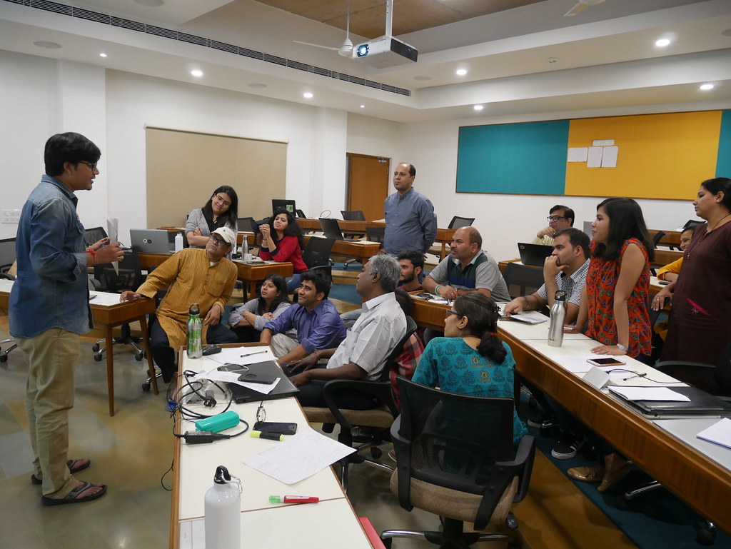
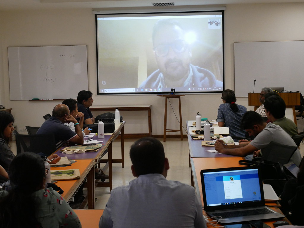
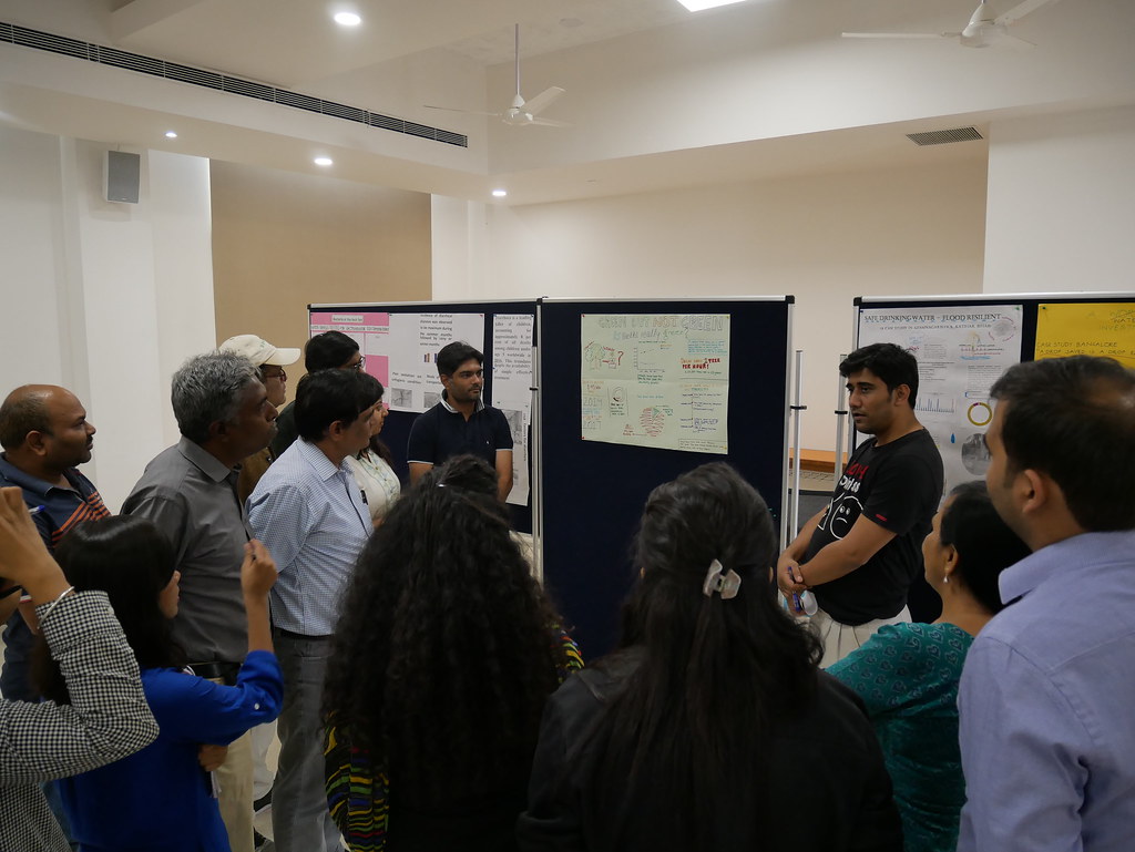
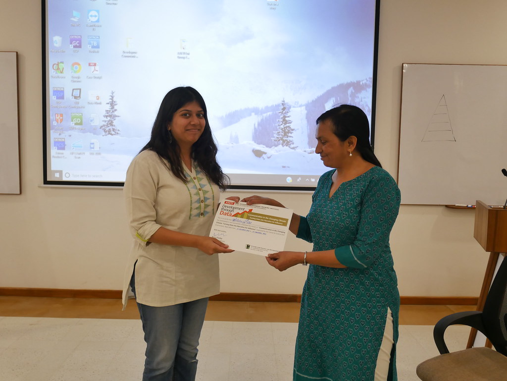
| Photos | |
 |
|
 |
|
 |
|
 |
|
 |
|
 |
|
 |
|
 |
|
 |
|
 |
|
 |
|
 |
|
 |
|
 |
|
 |
|
 |

Share this article